Work / 01 / San Antonio SkyRide
San Antonio SkyRide
An identity that flexes from tower signage to a phone screen.
- Client
- San Antonio SkyRide, with talkStrategy
- Role
- Lead Designer & Creative Strategist
- Scope
- Logo system, brand guidelines, environmental & promotional standards
The brief
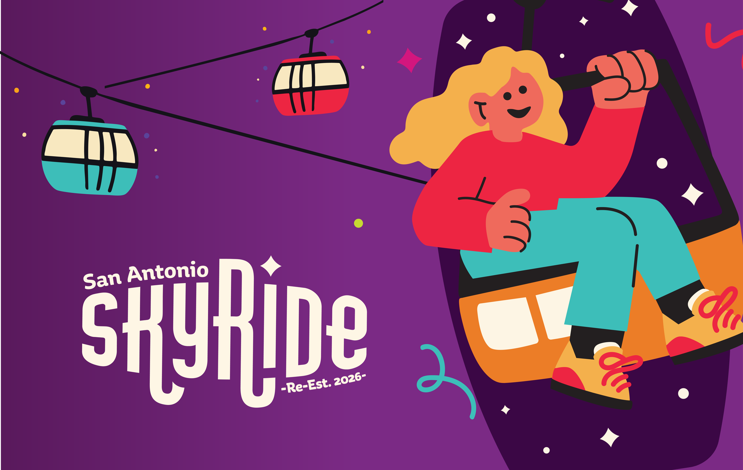
Reintroduce one of San Antonio’s iconic attractions with an identity as joyful as the ride itself — and make it hold up everywhere the brand has to live, from the tower to a phone screen.
The idea
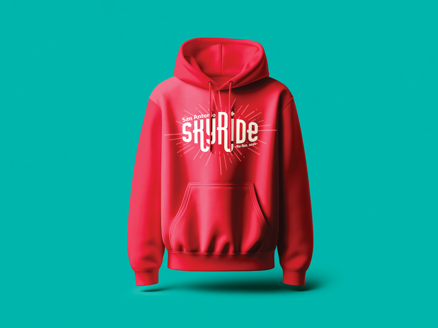
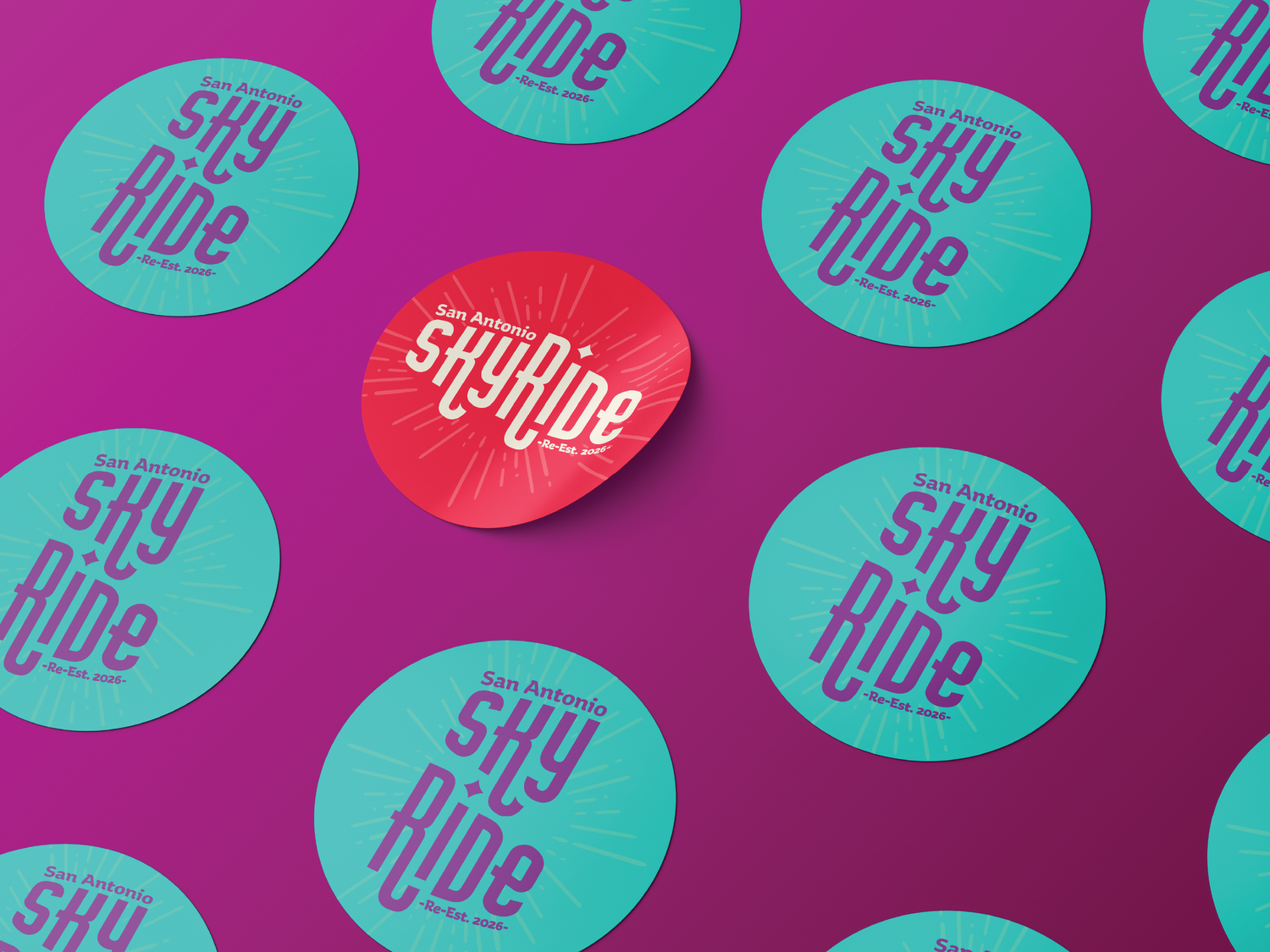
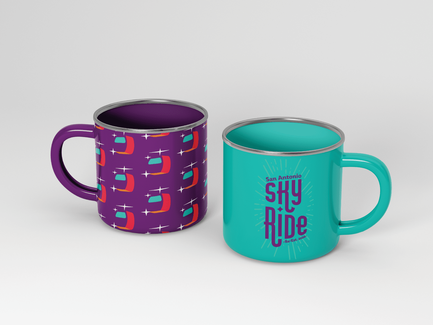
A vibrant, playful visual system rooted in bold color, motion, and moments of surprise and delight — capturing the energy of the experience itself.
The system
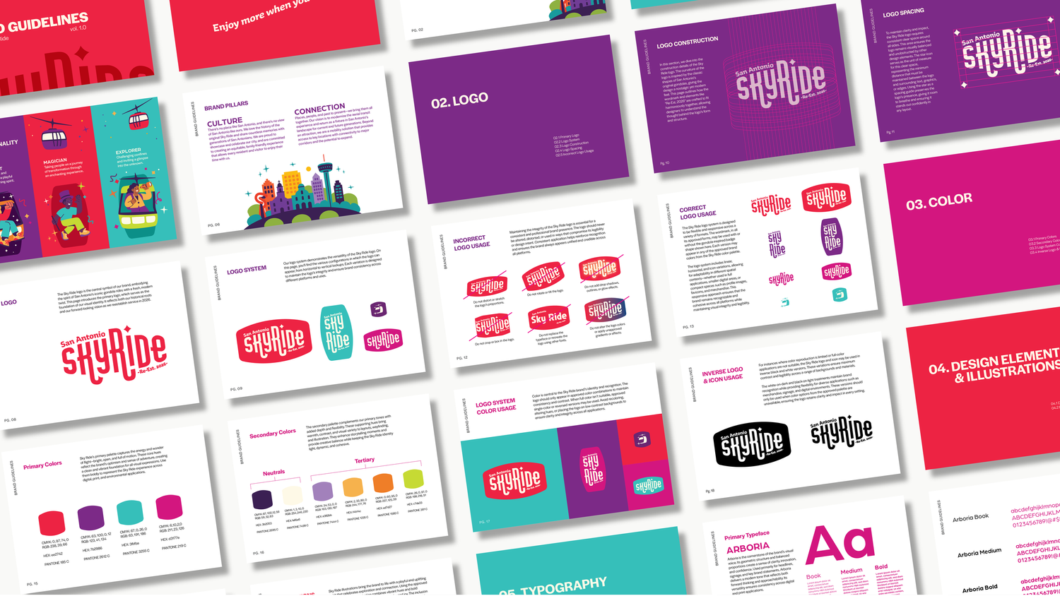
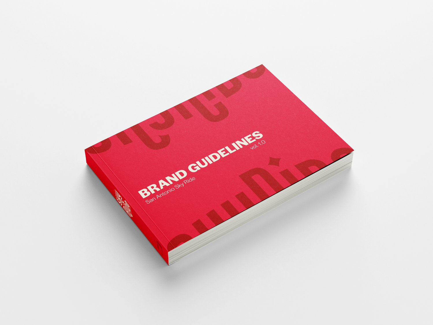
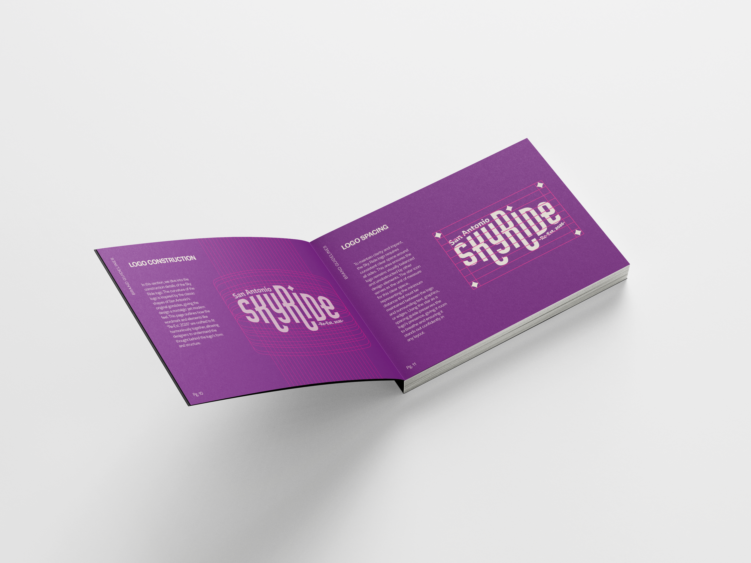
A responsive logo system that adapts from large-scale signage to digital and mobile without losing impact, backed by guidelines with clear standards for environmental, digital, and promotional use.
Process
[Two or three sentences: the routes you explored, what you cut, and why the final mark won.]
My role & team
Led the brand identity and guidelines development. [Who you directed or partnered with, and how you ran reviews.]
Production notes
Signage: [fabrication, materials, lighting] · Color: [PMS / CMYK specs] · Guidelines: [page count, print or digital]
Outcome
[Where the identity lives now — launch, signage installed, how the client uses the guidelines, any result.]
Next project · 02
Limitless
View project →